BACKGROUND
CLIENT
WileyX is a premium sunglasses manufacturer based in California. Over the past 30 years, WileyX has provided protective sunglasses for military, law enforcement and civilian markets. Their primary customers have been governments and B2B
MY ROLE
I led the UX design of the new website experience (including prescription ordering process) from May 2017 to December 2017. During the project, I worked alongside a Visual Designer, Content Strategist, 2 Product Managers, and a team of Developers.
I stopped working on the project during the detailed visual design phase. During the development phase, I occasionally supported the dev team to clarify any user related questions.
THE CHALLENGE
Old WileyX website was designed to primarily for B2B customers including sales people, wholesellers, and government buyers. To optimize the site for B2C customers, there were 2 primary challenges to address:
1. Restructure the main navigation architecture to best serve B2C customers.
2. Design a prescription sunglasses ordering module.
DISCOVERY
STAKEHOLDER INTERVIEWS
Our team scheduled several discovery sessions with the client to clearly understand their business goals and expected features on the new website.
USER INTERVIEWS
Our team visited several resellers to inquire about:
1. If customers are aware of WileyX brand.
2. How customers usually look for protective glasses & sunglasses (example: are they asking for recommendations or do they usually know which brand/product they want to buy).
3. Which protective glasses & sunglasses brand the reseller usually recommend.
4. Resellers' feedback on current WileyX website.
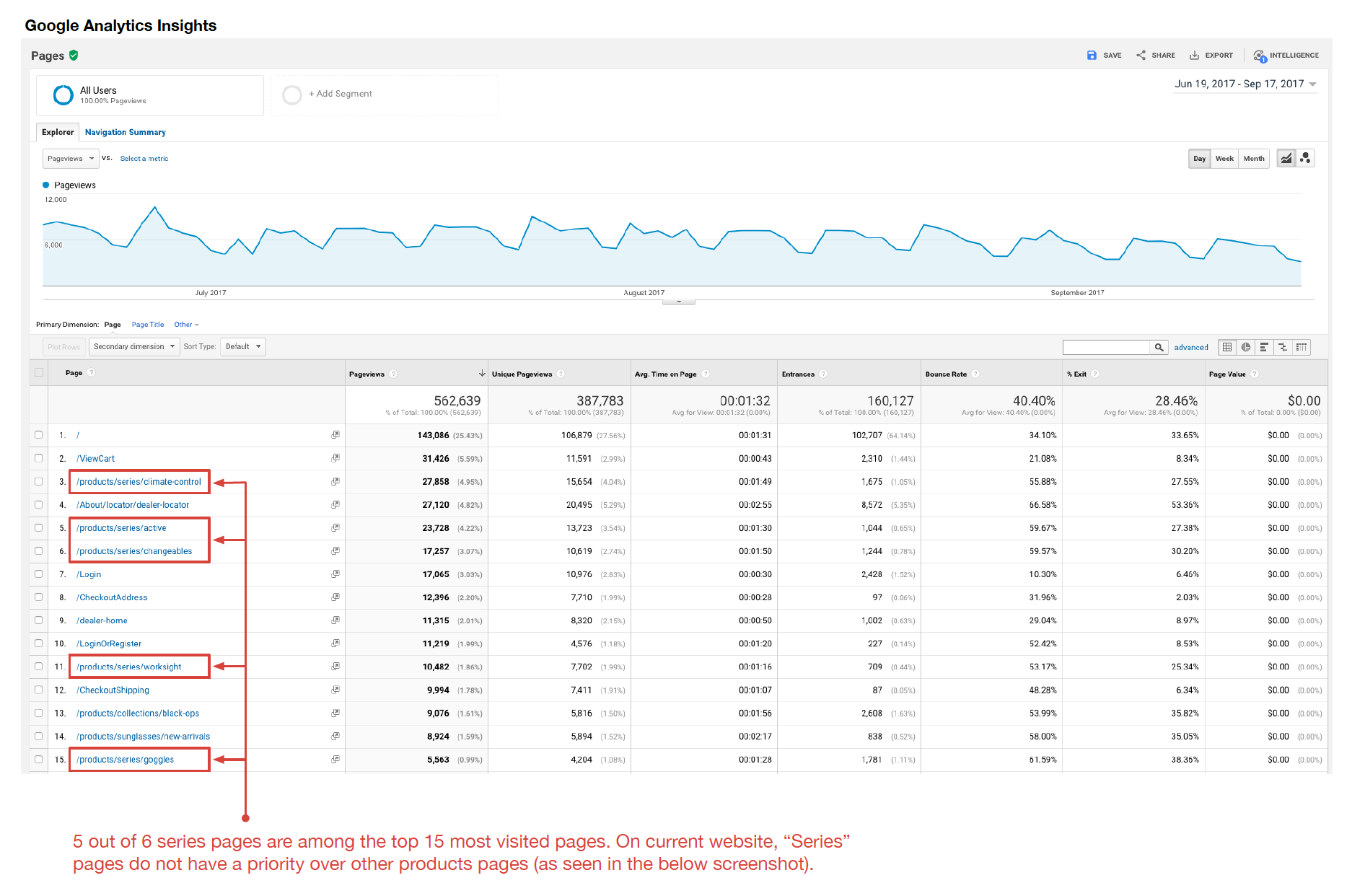
UNDERSTANDING USER BEHAVIORS
In making any decision regarding the information architecture, our team made sure to check analytics data to verify if the changes we are considering are backed by the user behavior data. This is critical so that our team would not make decisions based on uninformed/unverified preferences.
DEFINE
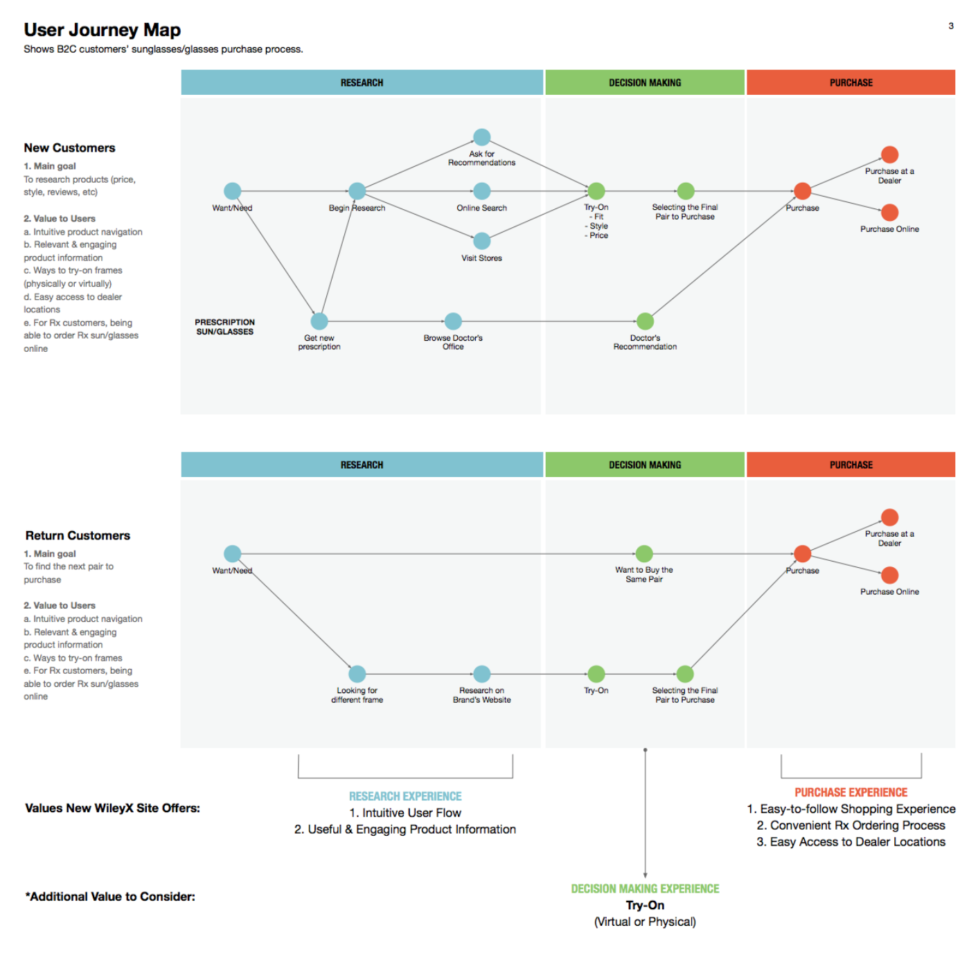
USER JOURNEY MAP
After interviewing clients and users, our team has identified how users search and buy sunglasses. The journey map gave our team insights about which pages and features add value to users while they are on research, decision making, or purchase phase of the journey.
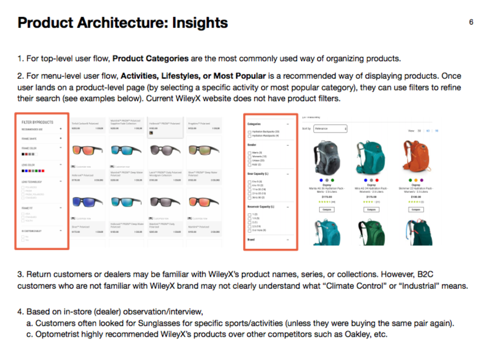
PRODUCT INFORMATION ARCHITECTURE
By conducting comparative and competitive analysis on several brands (along with in-person interviews with users), our team identified key insights about product information architecture.
DESIGN
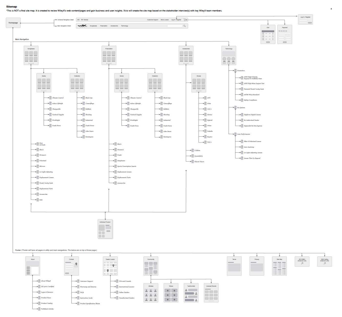
SITE MAP
WIREFRAMES
1. Main Navigation
Main navigation required a big change since the current website was primarily built for B2B customers who already know about WileyX's products. B2B customers often look for products by a specific model or collection name. However, majority of the B2C customers are first-time customers. Therefore, main navigation & menu needed to be organized by categories that B2C users are familiar with.
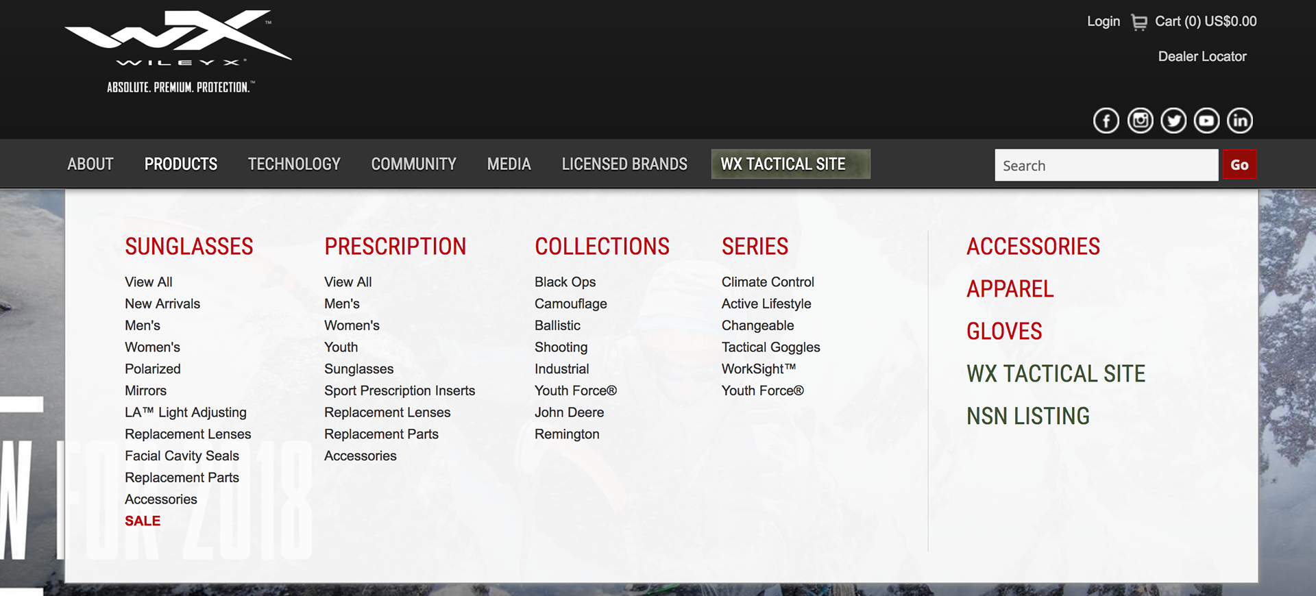
Old Main Navigation & Menus
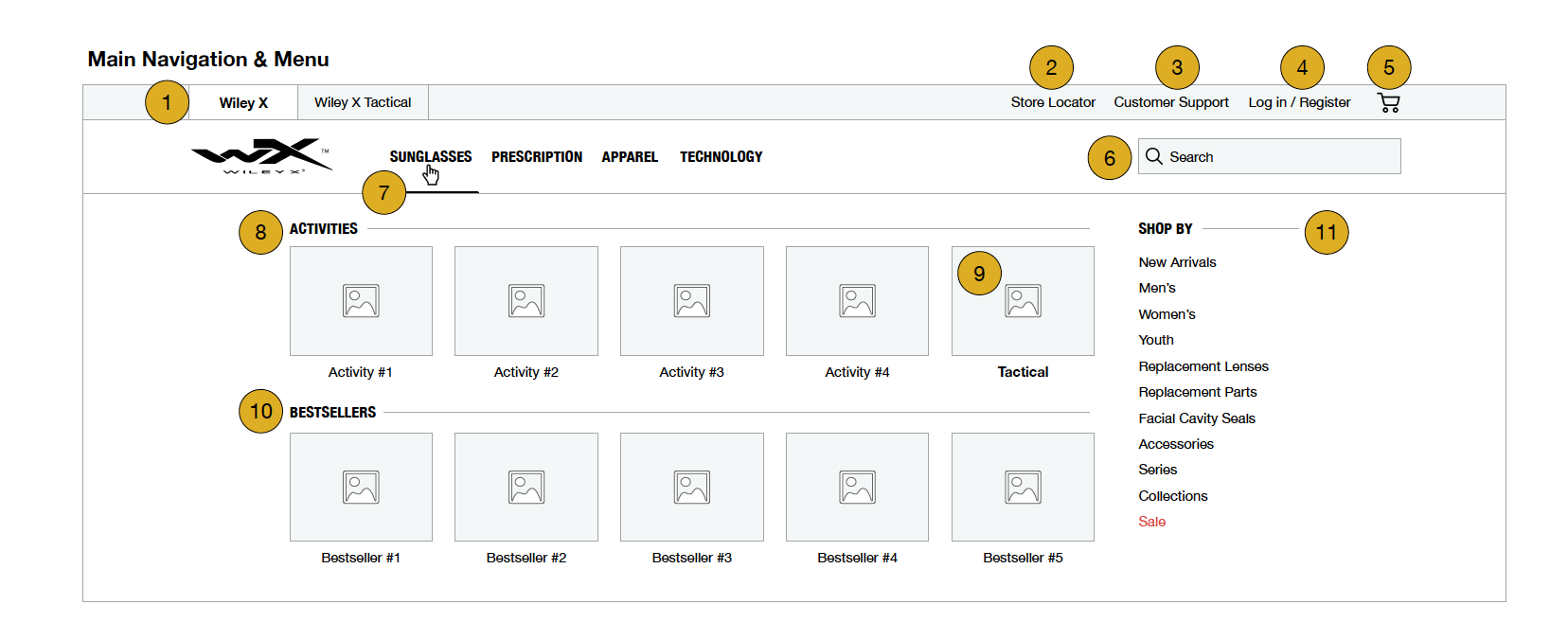
Revised Main Nav & Menus
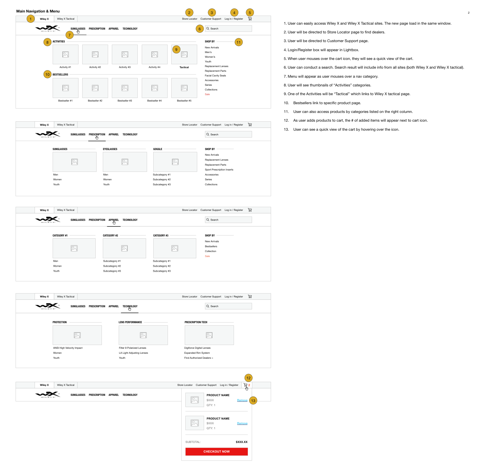
All Main Nav & Menus
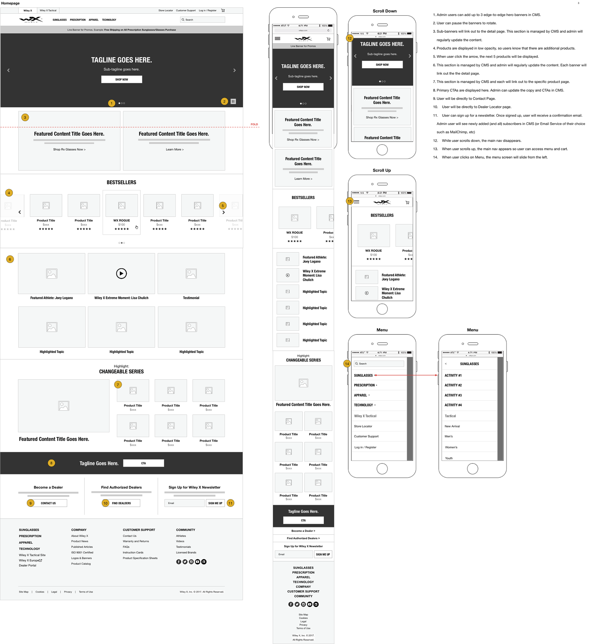
2. Homepage
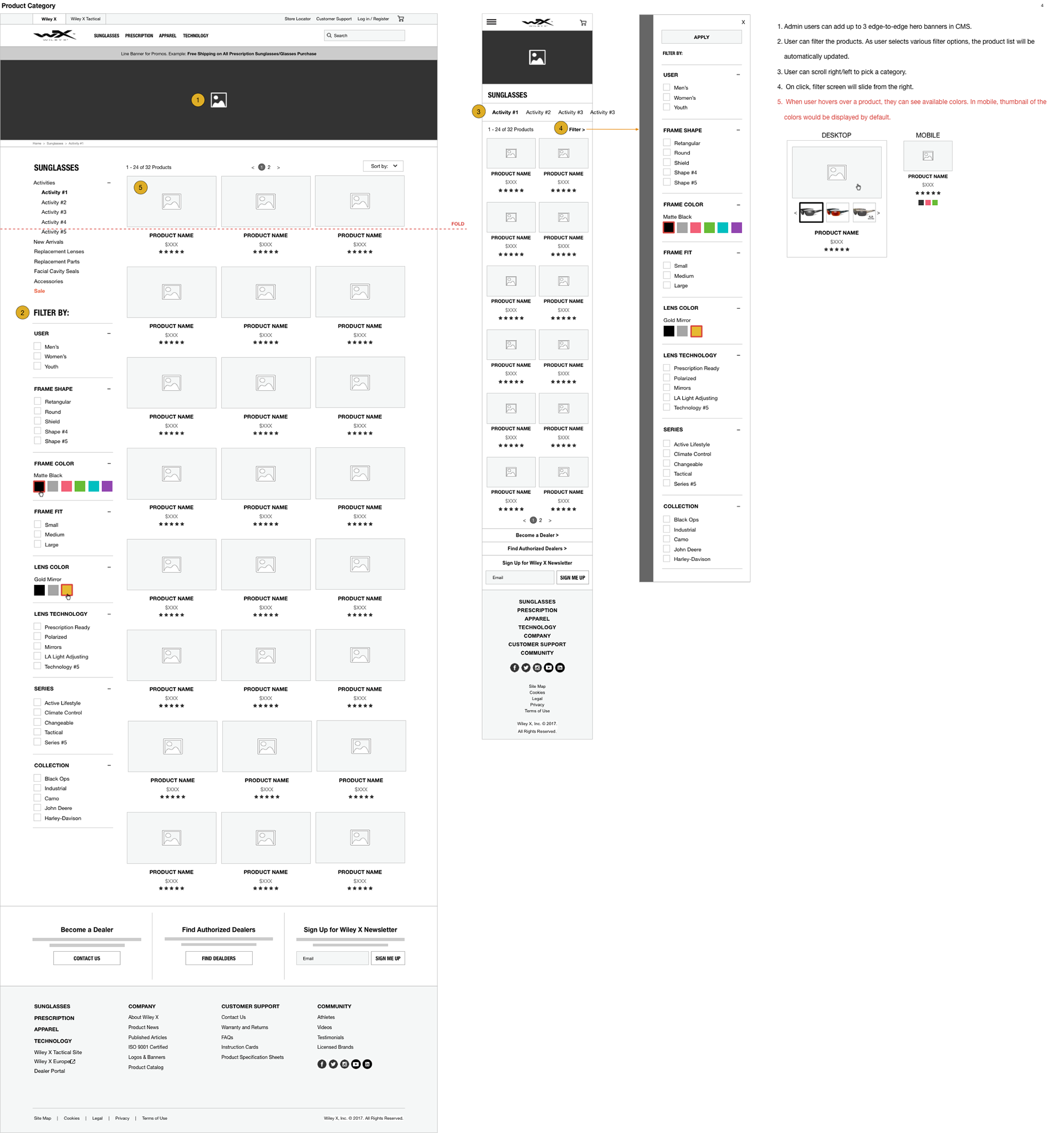
3. Product Category Page
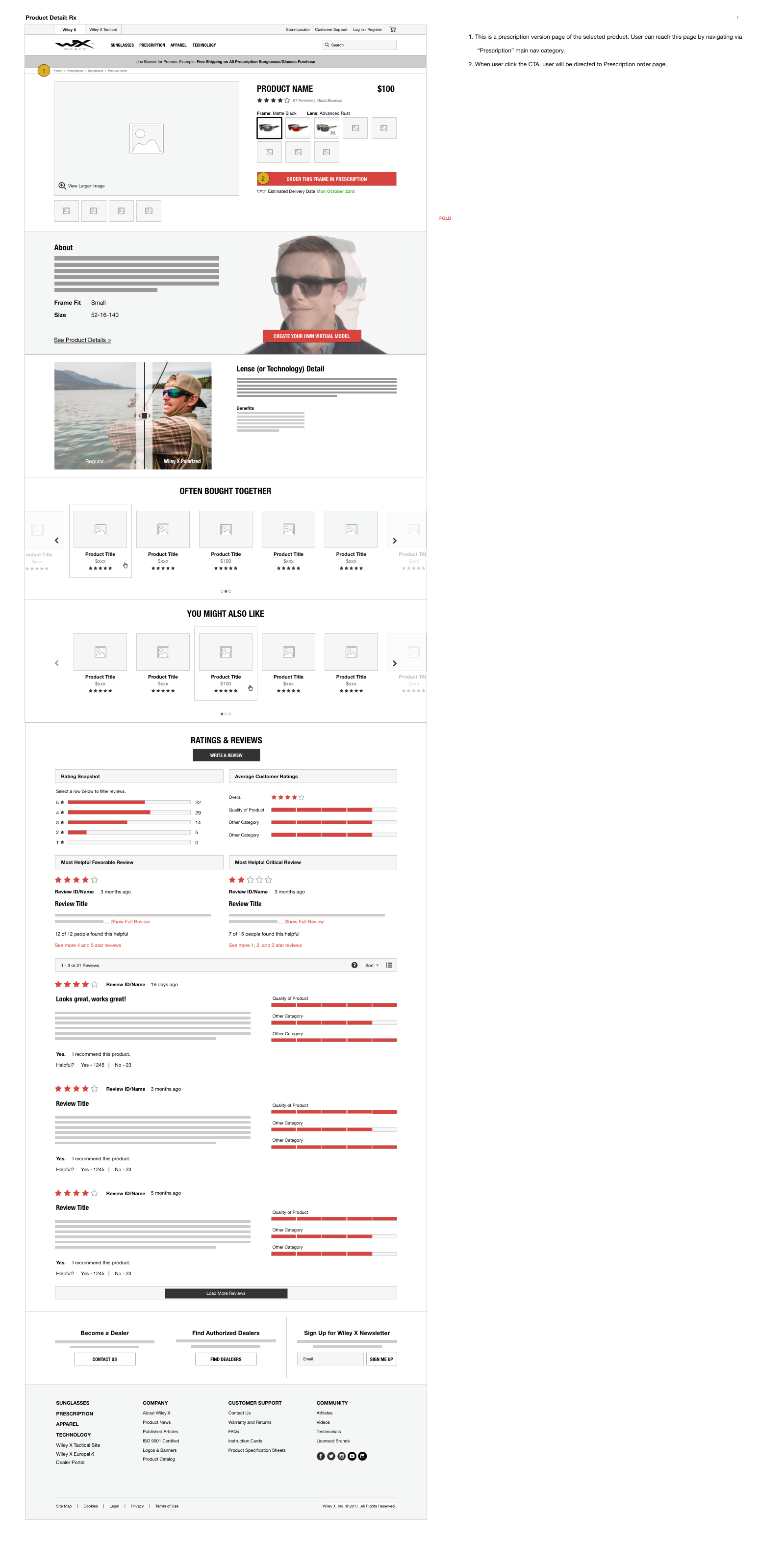
4. Product Detail Page
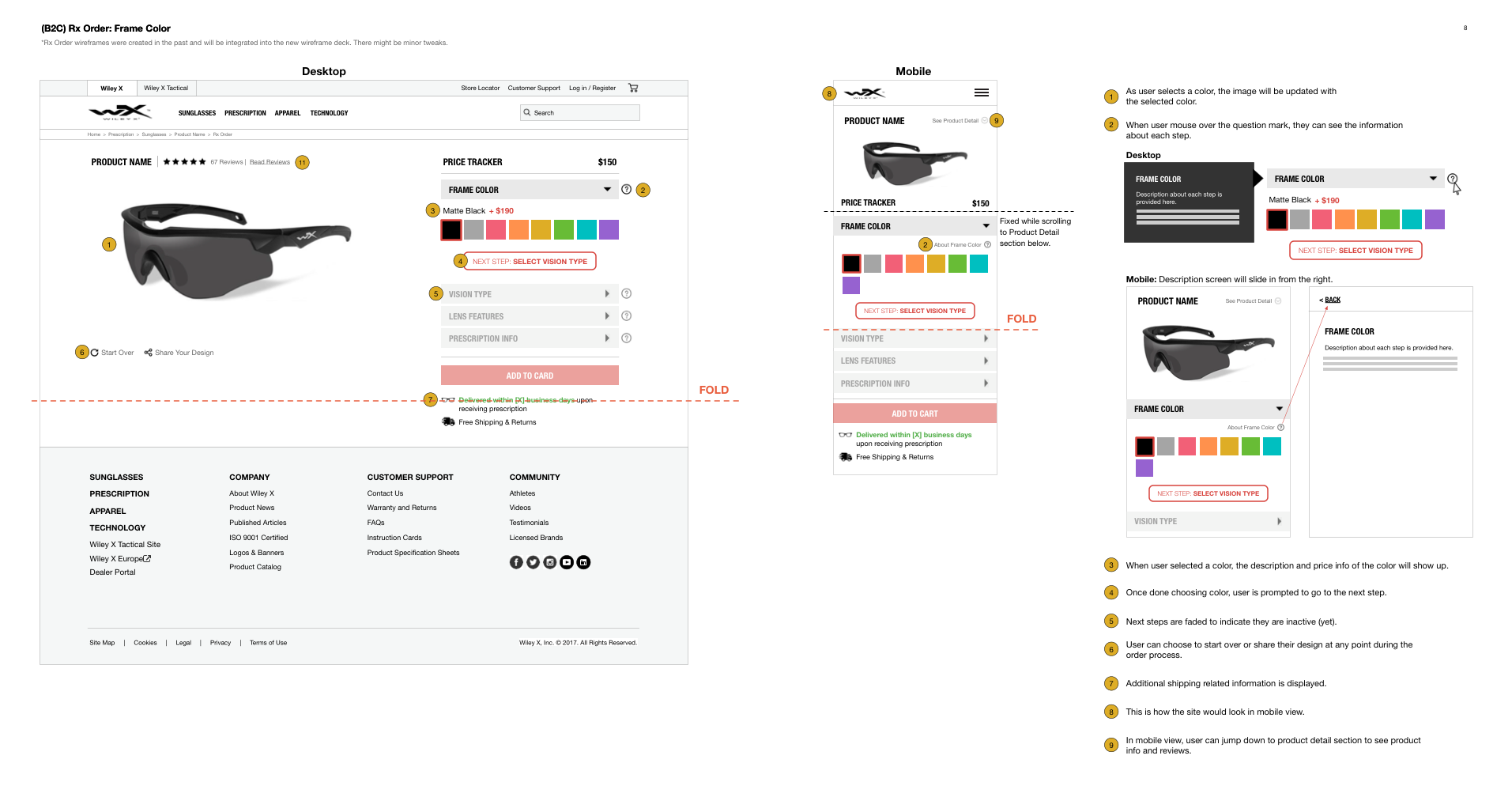
5. Prescription Order Page: Frame
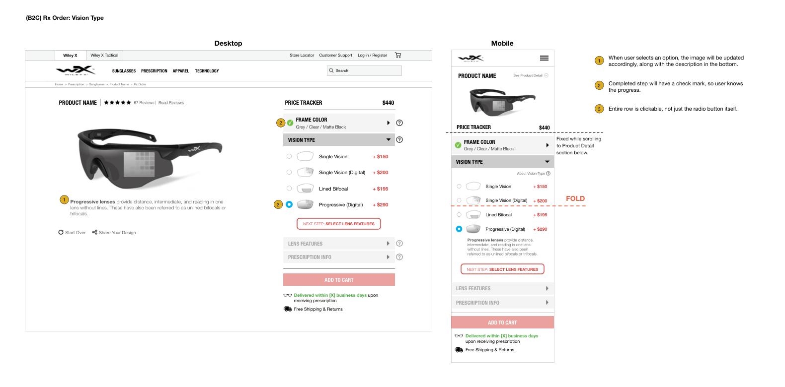
6. Prescription Order Page: Vision Type
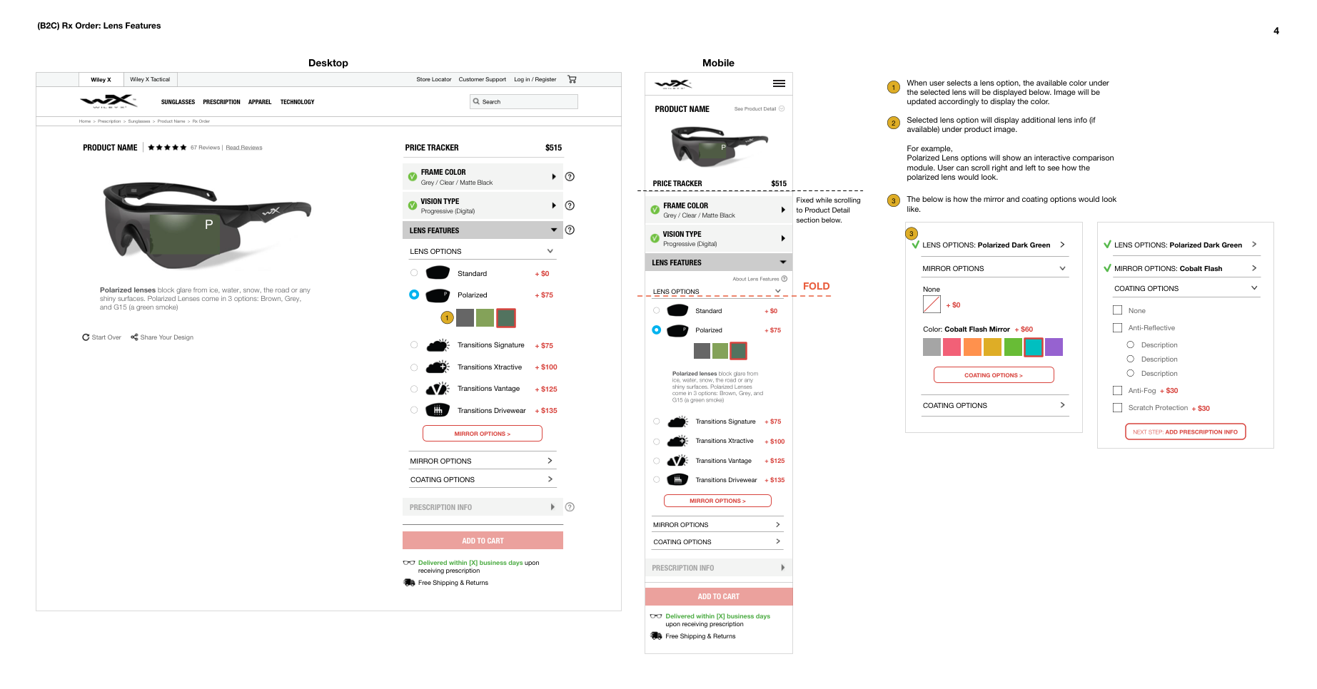
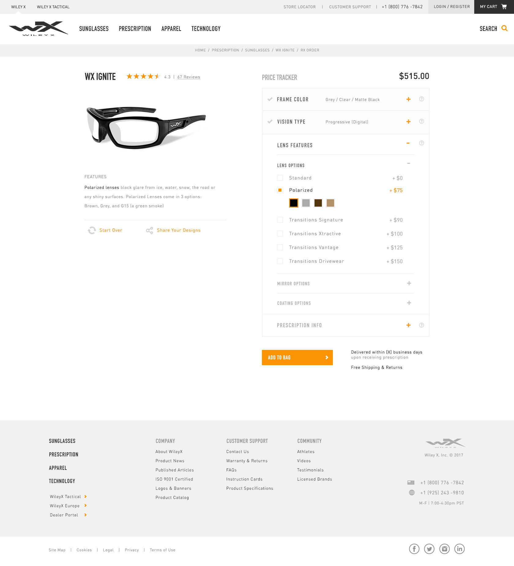
7. Prescription Order Page: Lens
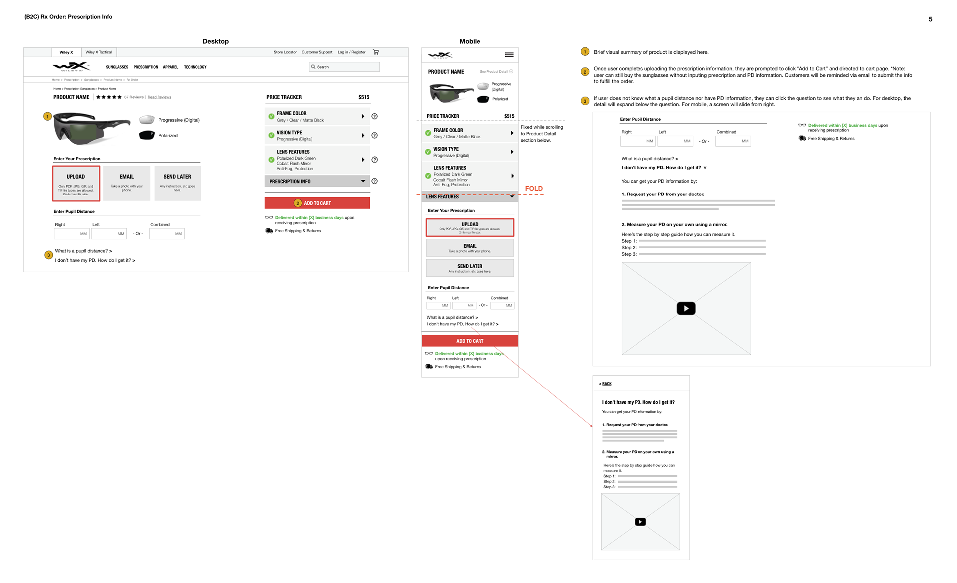
8. Prescription Order Page: Prescription Info
VISUAL DESIGN
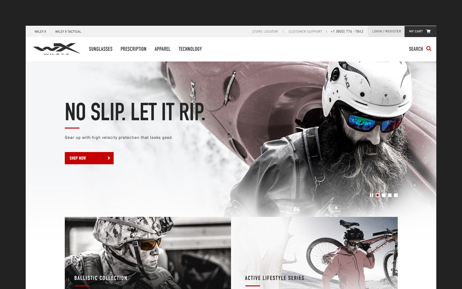
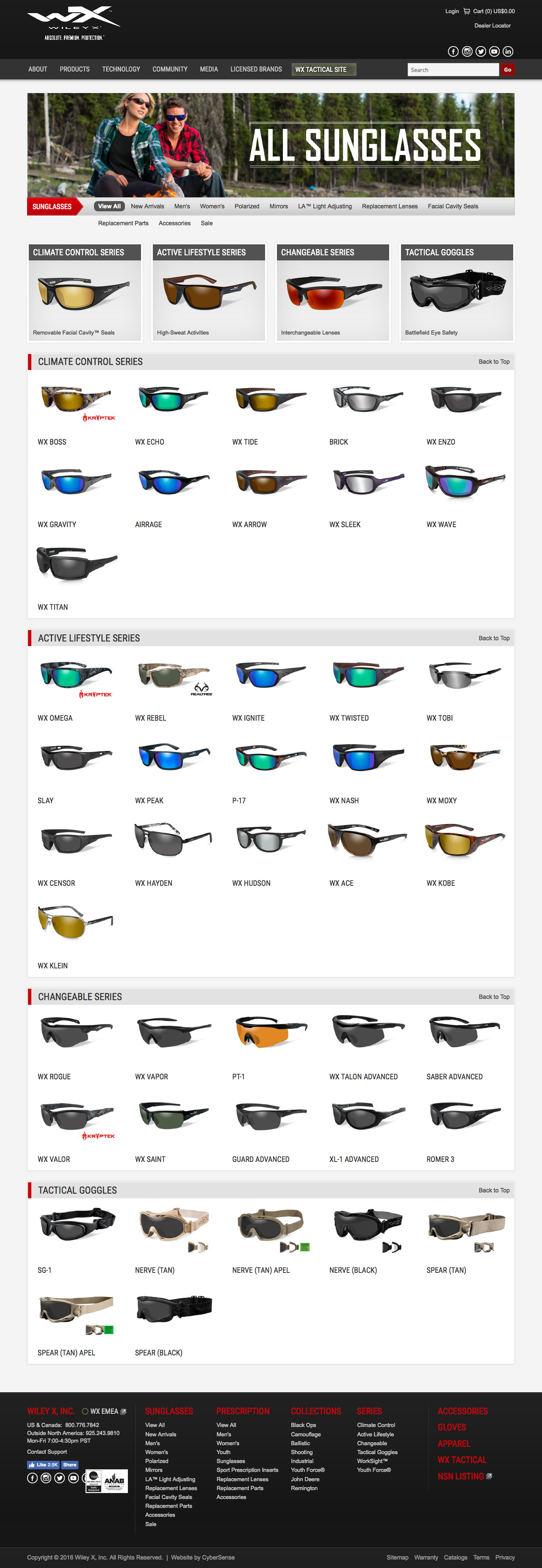
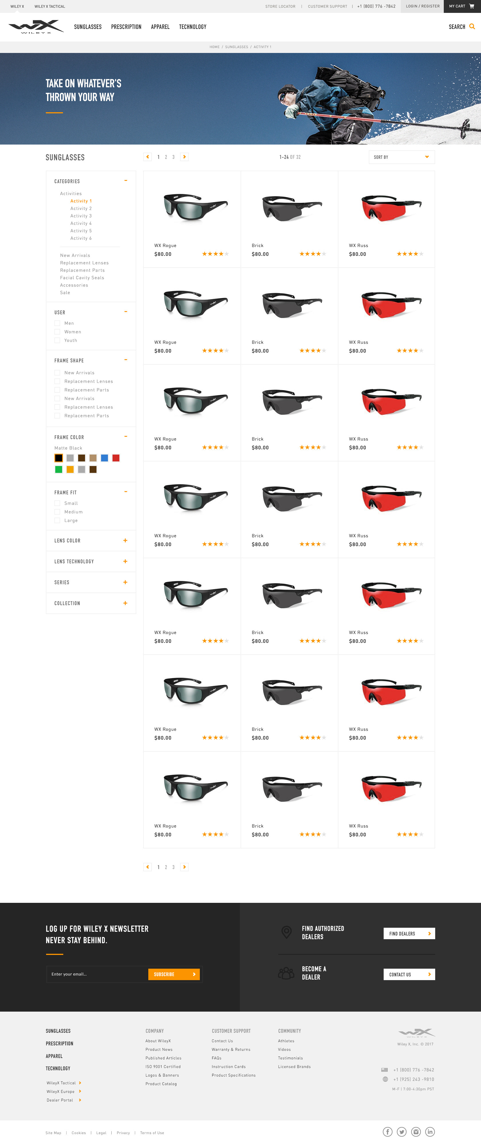
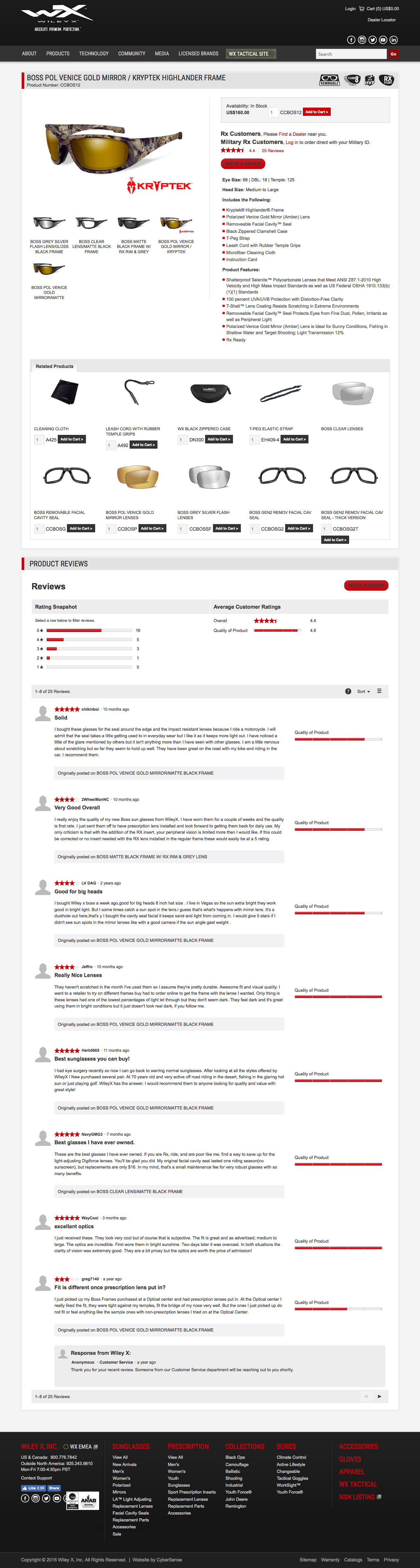
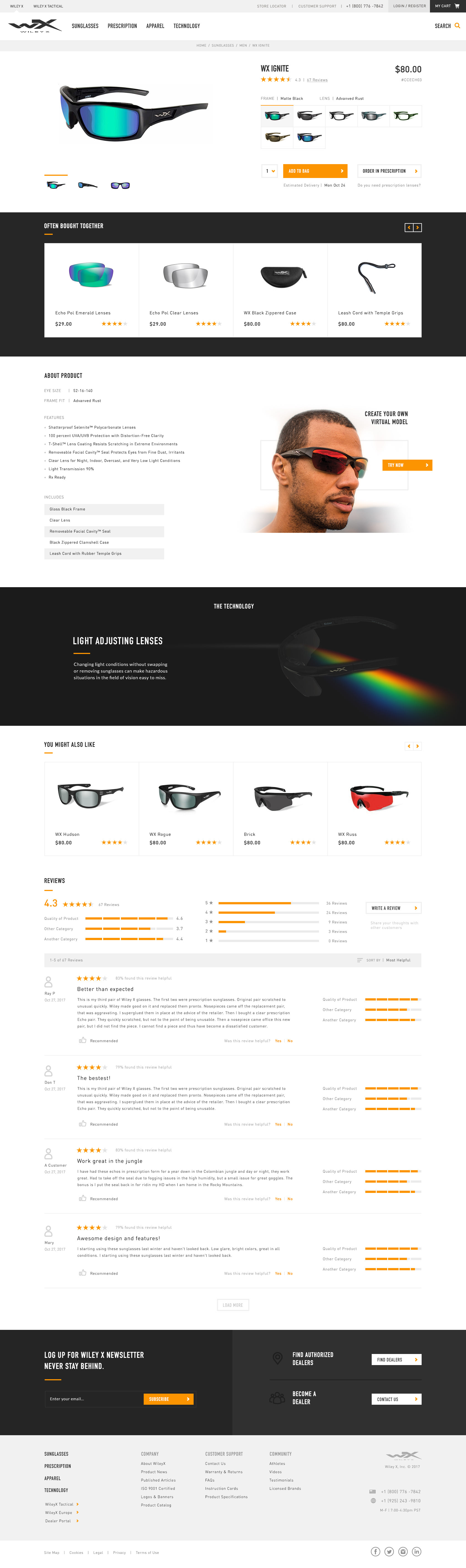
Credit for visual design goes to our design team. My involvement in this phase was to provide feedback on overall visual direction and interaction design. See the comparison between the current site and new one below.
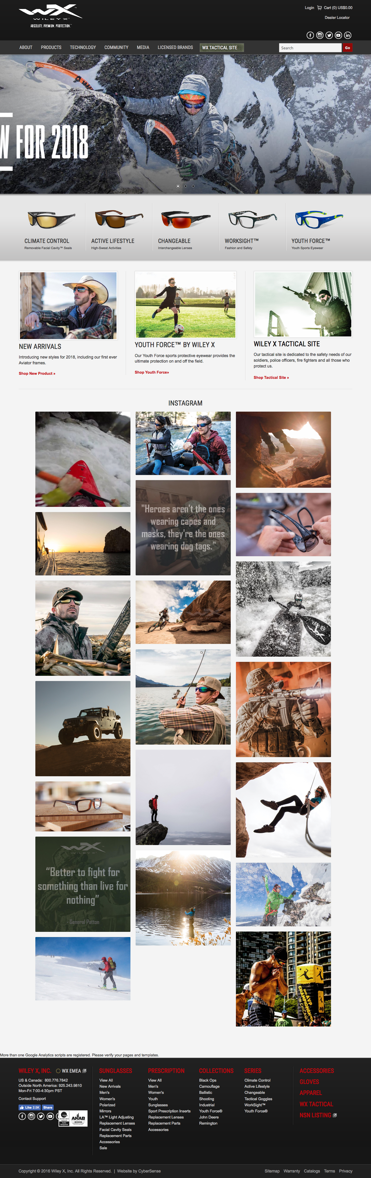
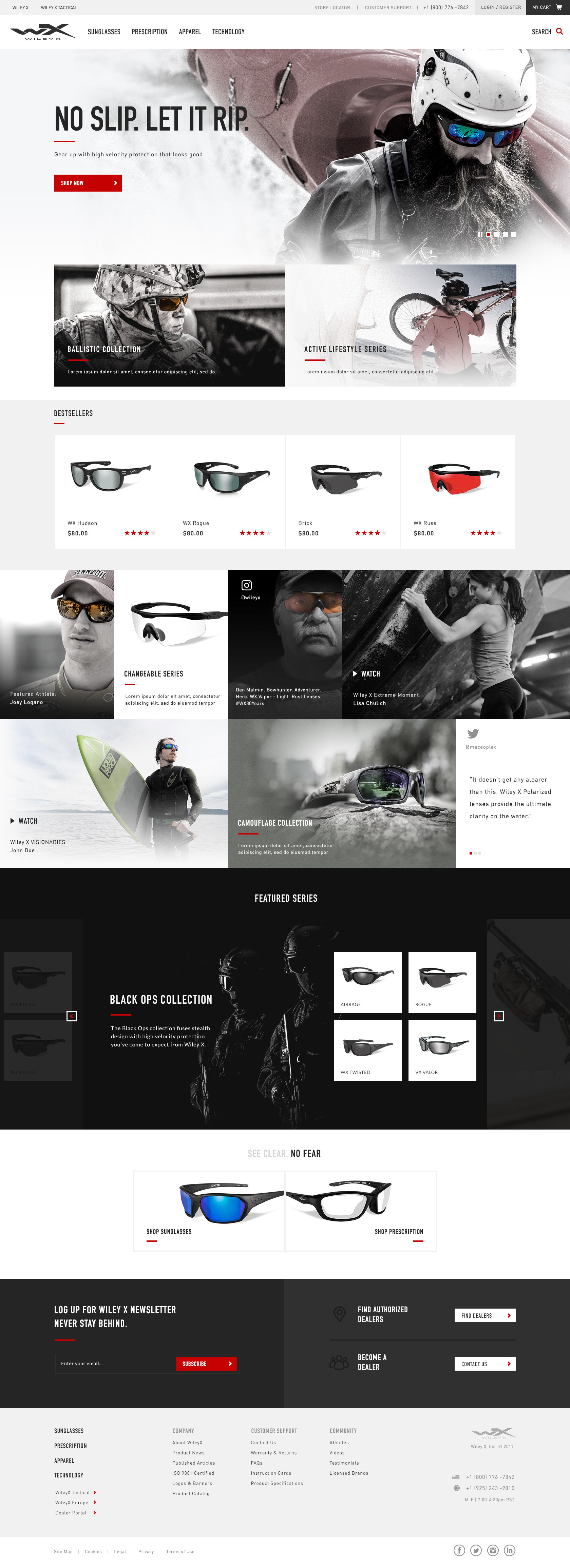
1. Homepage Design Comparison
2. Product Category Page Comparison
3. Product Detail Page Comparison
4. Prescription Order Page
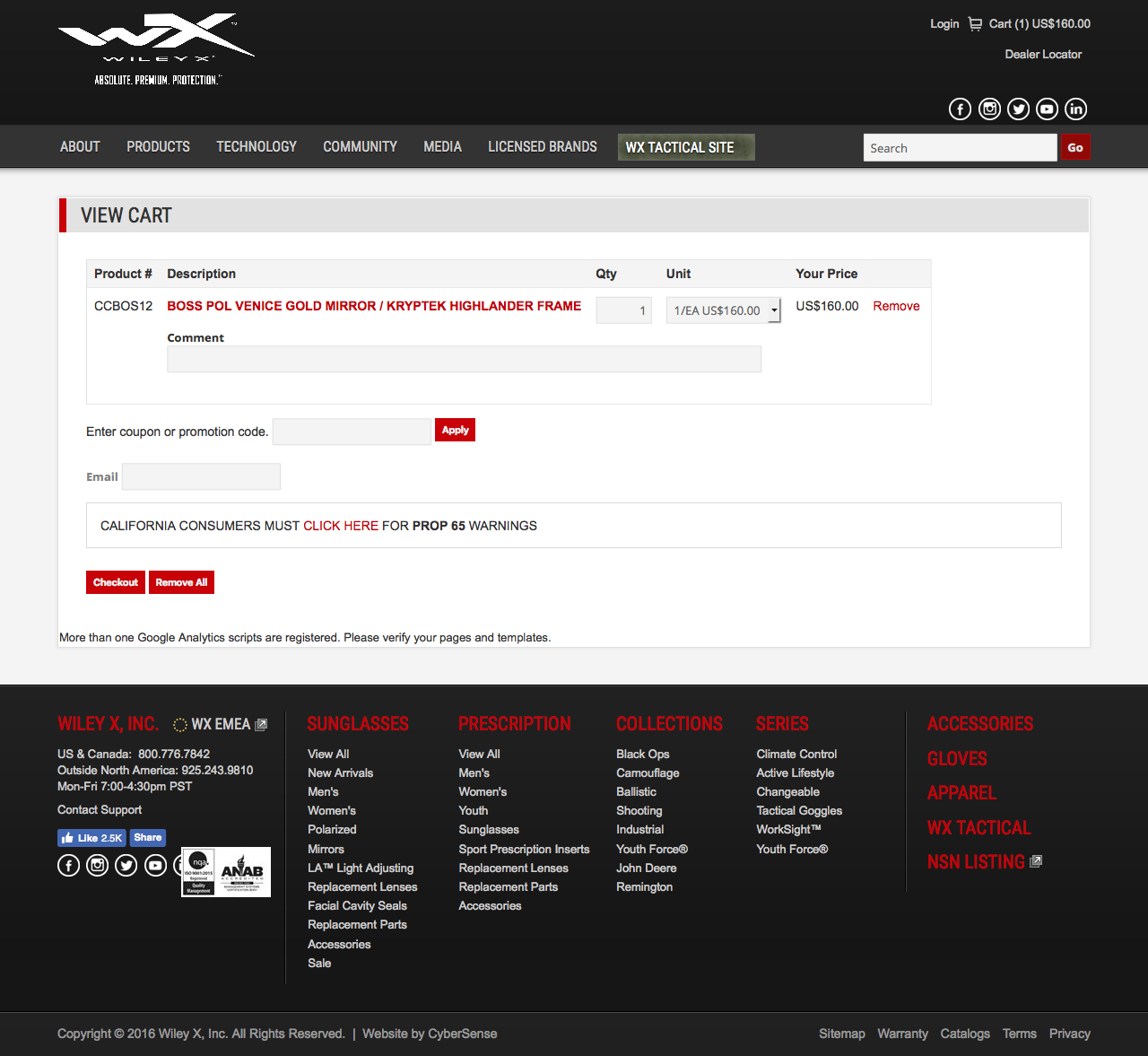
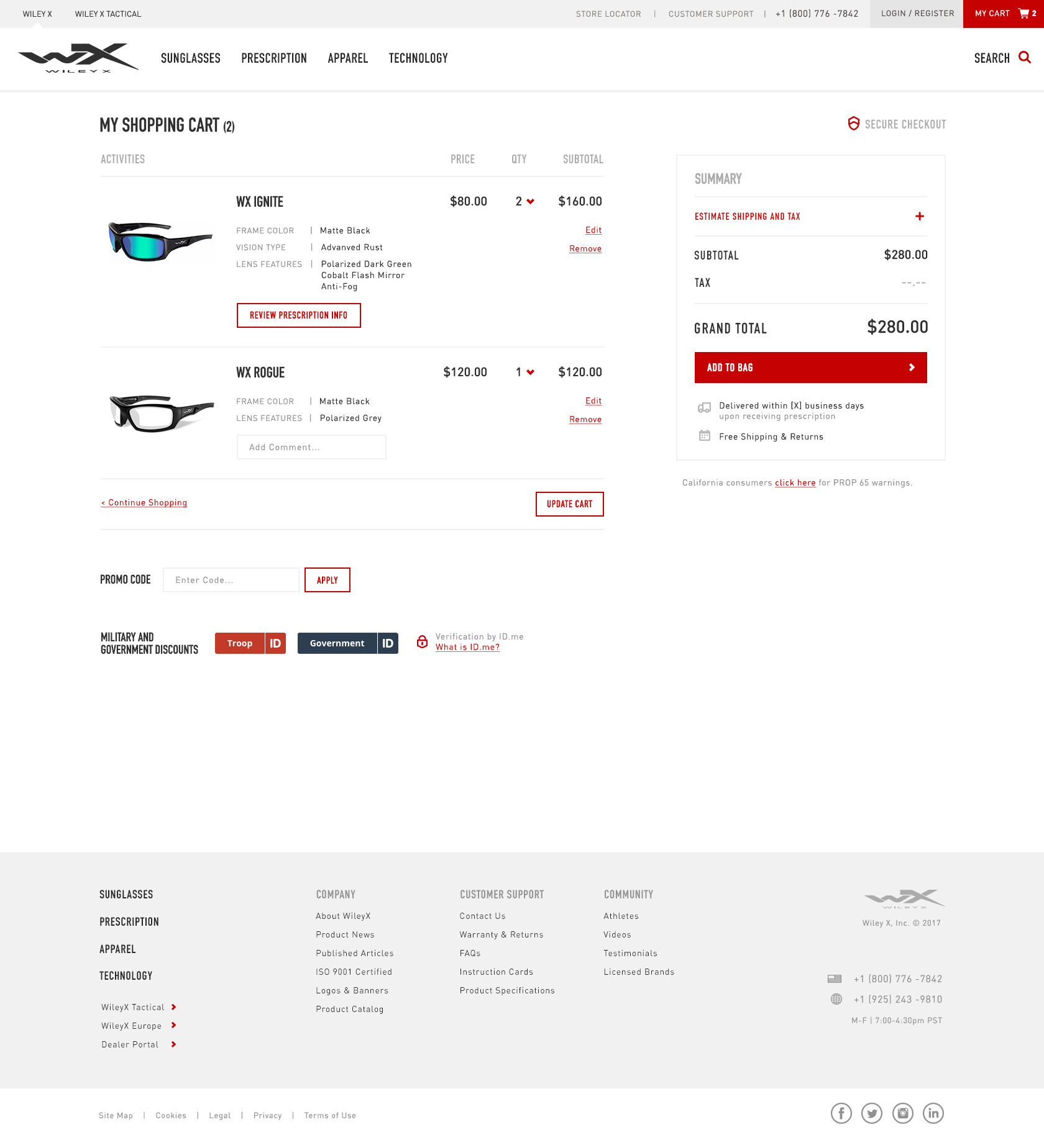
5. Cart Page Comparison
INVOLVING ALL TEAMS
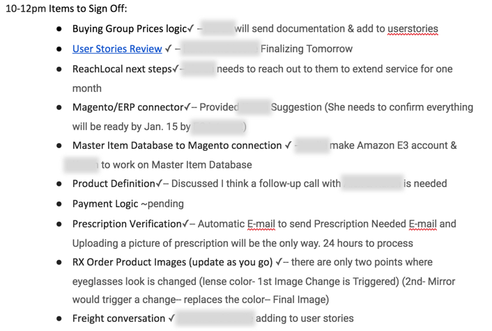
From the beginning of the project, we (UX team) made sure to involve other teams (especially Dev team) so that their ideas and feedback are counted in the UX process. The below is an example of agenda we went over with client and various internal teams.
IMPLEMENTATION
New site went live early 2019. Visit WileyX's website.