Summary
Project: First Unified Design System for EIS Platform
Company Type: B2B SaaS (Insurance Management Services)
Products Covered: 5+ web applications
Users: Supports over 30 million customer records
Duration: Phased rollout for initial launch (2020), Sketch to Figma migration (2021), InVision to Storybook (2023), and continuous improvements (2021-2026)
My Role: Senior UX Designer — Design System Lead
Team: 3 designers, 4 frontend engineers, UX director
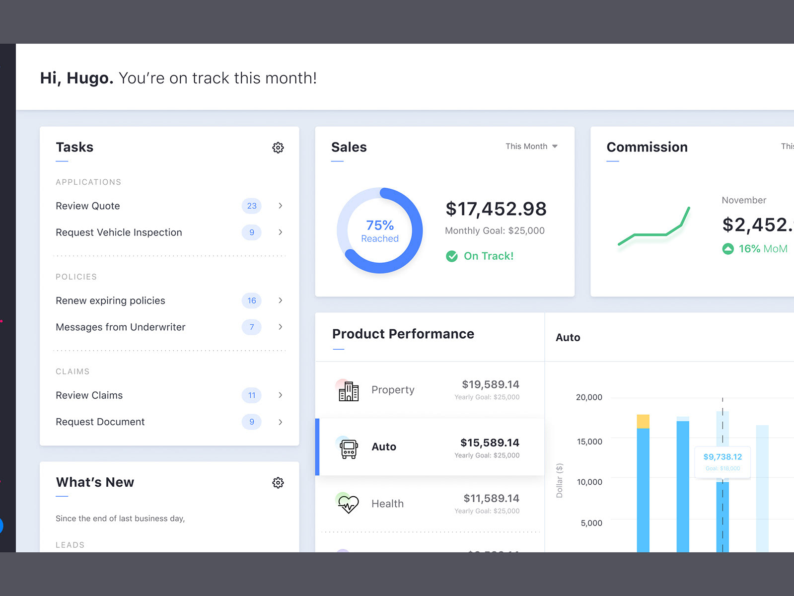
Outcomes & Impact
After 12 months of phased rollout:
🚚 Delivery Impact
• ~30% faster design-to-dev cycles
• Reduced rework due to clearer spec
• Fewer QA UI defects
📐 Design Impact
• Major consistency improvement across products
• Shared UX patterns reduced cognitive load
• Engineering Impact
• Shared component reuse increased
• Reduced duplicate frontend builds by ~50%
🏢 Organizational Impact
• Increased cross-team collaboration
• Higher UX maturity perception from leadership
1️⃣ Problem Definition
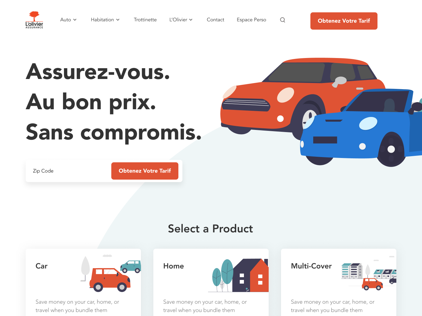
EIS offered multiple enterprise applications developed by separate product teams over several years (since 2008). Each product evolved independently, resulting in various problems.
Leadership recognized that inconsistency was increasing development cost and training time while hurting usability and brand trust. A unified design system was proposed to improve scalability and quality across the platform.
Through internal audits and stakeholder interviews, we identified several systemic issues as listed below. This was not just a UI issue — it was an operational and product scalability problem.
📐 Design Problems
• Same UI elements behaved differently across products
• Form patterns varied widely
• Navigation models were inconsistent
• Accessibility compliance was uneven
⚒️ Engineering Problems
• Multiple teams rebuilding similar components
• No shared component standards
• High regression risk
• Frontend duplication
🤦 User Problems
• Users switching products had to relearn patterns
• Increased cognitive load
• Higher training dependency

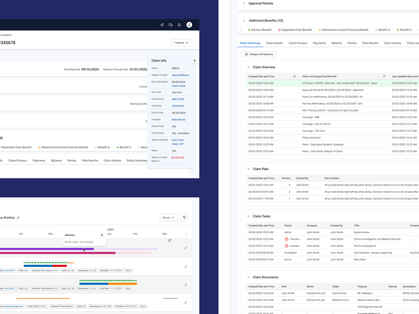
Billing
Policy Intake
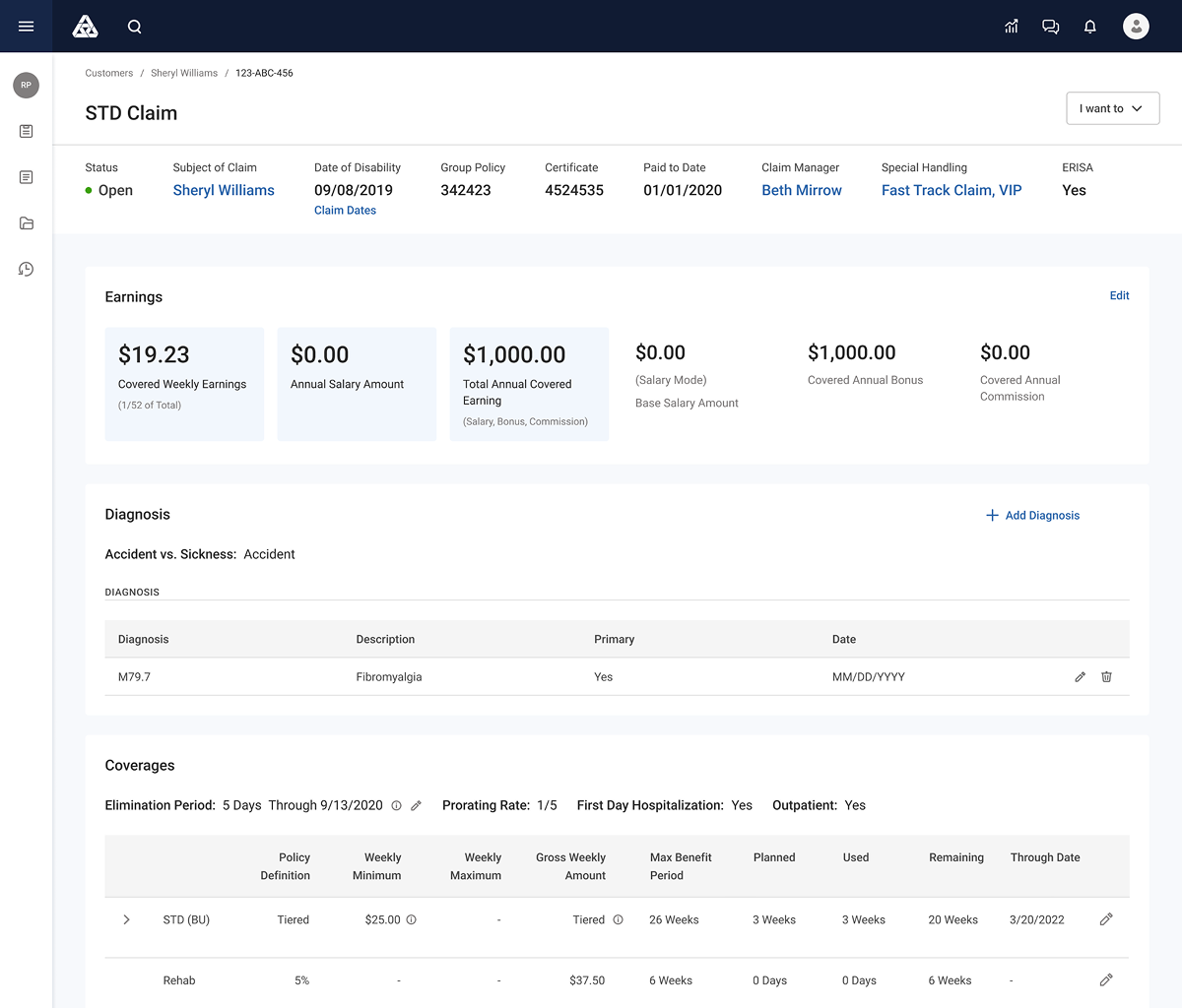
Claim
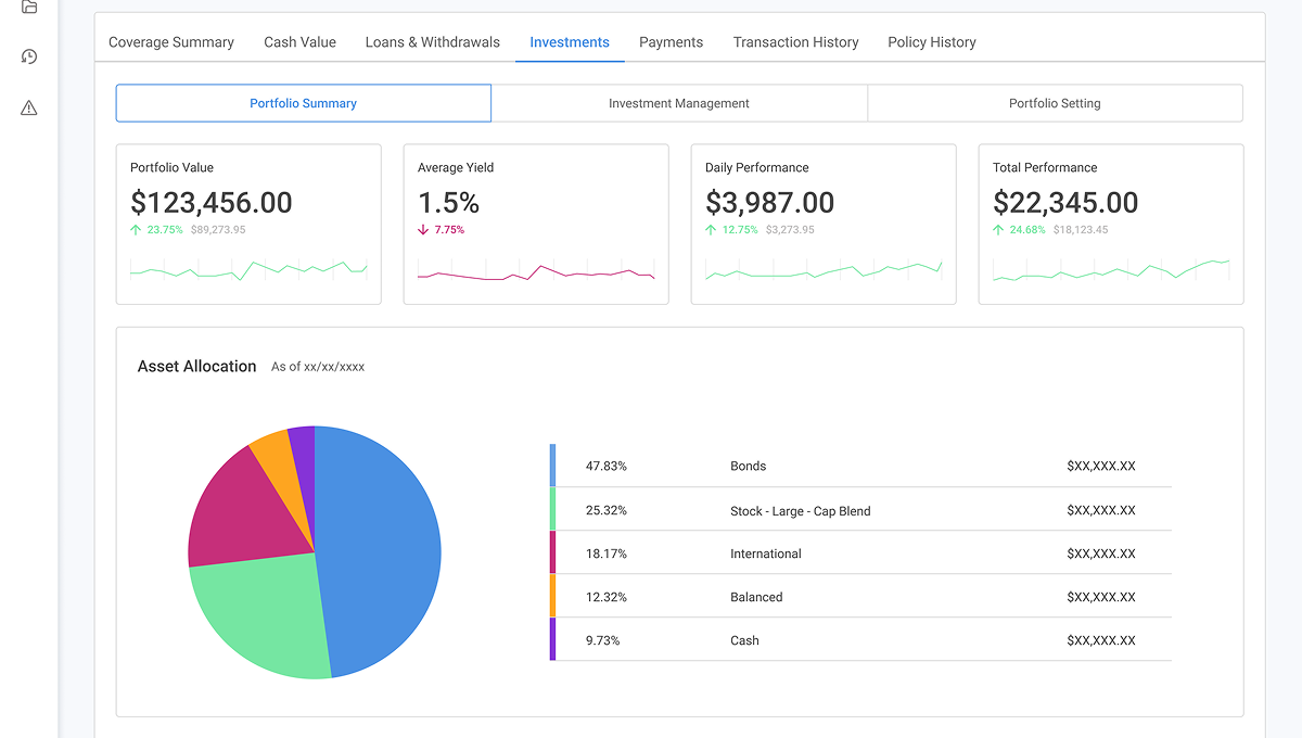
Inconsistent UI across Products (Billing, Claim, Policy, etc.) and Versions.
2️⃣ My Responsibilities
As Design System Lead, I was responsible for:
• Defining system principles and foundations
• Leading component standardization
• Aligning design and engineering component models
• Establishing contribution and governance workflows
• Driving adoption across product teams
• Mentoring designers contributing to the system
• Facilitating cross-team design reviews
"David was a key pioneer of the EIS Design System, playing a critical role in establishing scalable, consistent patterns that improved design quality and accelerated delivery across teams."
- Zankhana Joshi, Director of User Experience Design at EIS Group
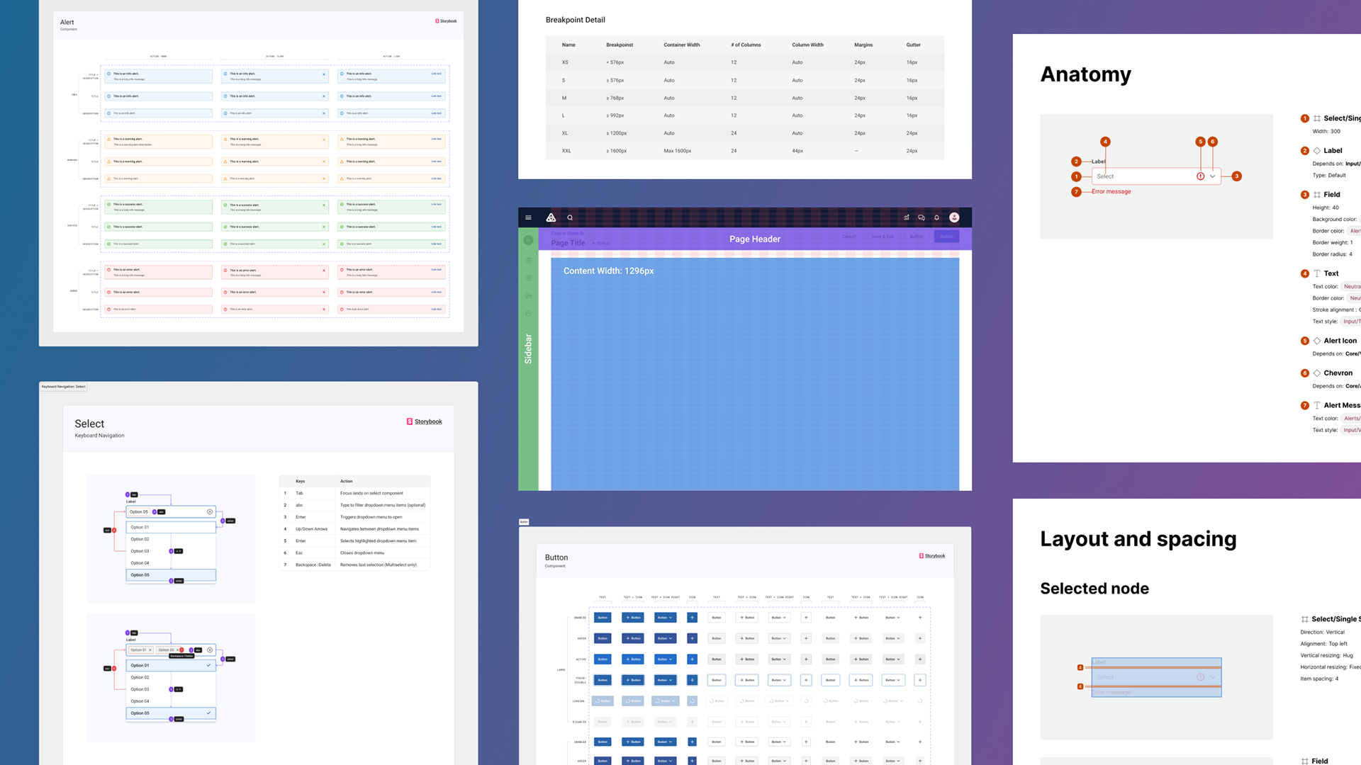
3️⃣ Discovery & System Audit
I led a cross-product UI audit across all applications.
We analyzed:
• 500+ screens
• 180+ UI patterns
• 70+ component variations
• Accessibility violations
• Pattern inconsistencies
We clustered UI patterns into:
• Core components and styles
• Atoms, Molecules, Organisms, Templates, and Pages (following Atomic Design methodology)
• Workflow structures
• Edge-case exceptions
Key Findings
👉 Over 80% of components were redundant variations
👉 Form fields had 9 different validation styles
👉 Buttons had 6 behavior variants
👉 Table interactions were inconsistent
👉 Accessibility labels were frequently missing
👉 This audit became the foundation for system prioritization.
4️⃣ Design Principles
In creating components, it was critical that we first define system principles. These principles guided every design decision and tradeoff.
• Behavior consistency over visual consistency
• Standardized but flexible
• Code-aligned components
• Enterprise workflow support
• Scalable across product maturity levels
5️⃣ Design & Release Strategy
The design team had to make a major decision early in the process: Do we standardize everything immediately — or phase?
We chose a tiered rollout model strategy for faster adoption and early wins.
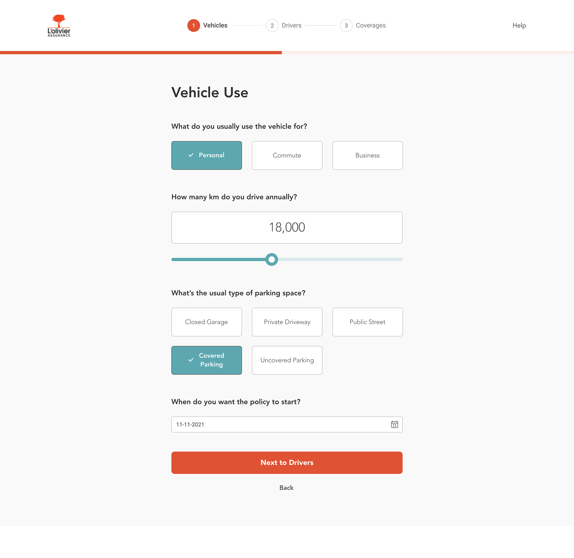
Tier 1️⃣ — High-impact Shared Components
Buttons, inputs, dropdowns, tables, modals, etc.
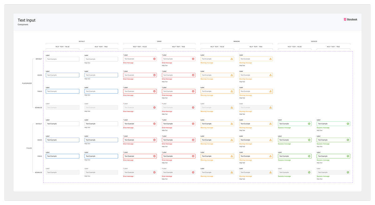
Input
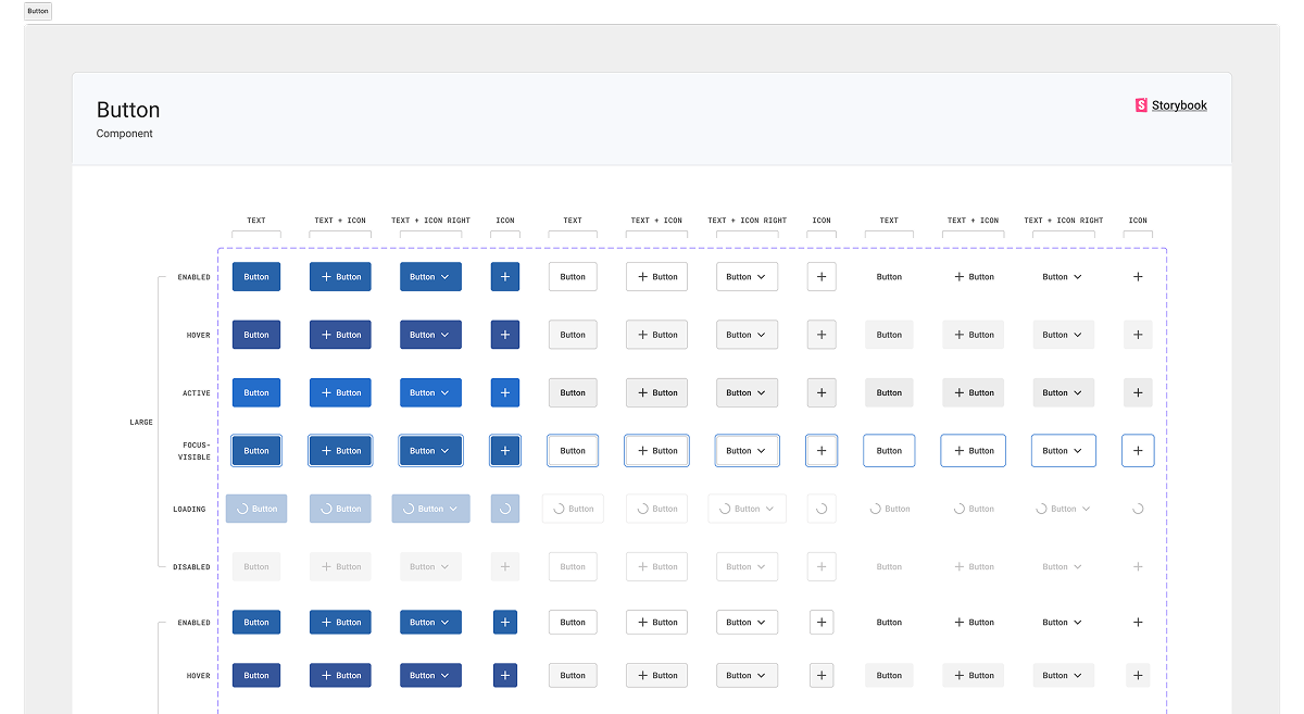
Button
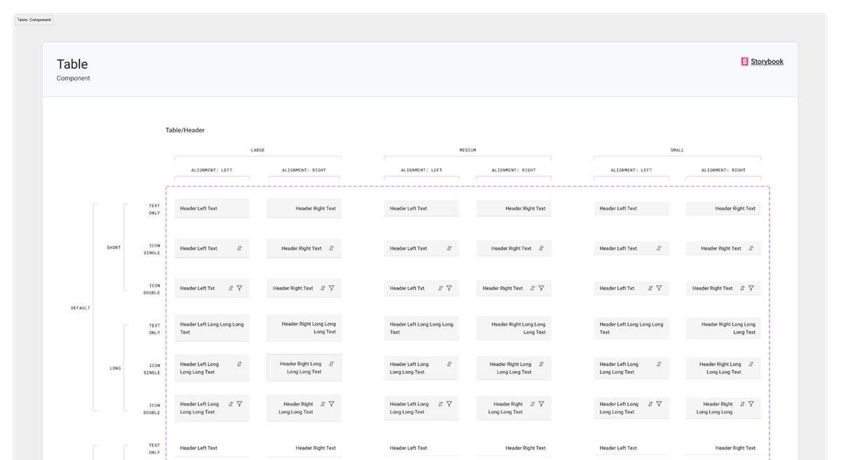
Table
Tier 2️⃣ — Workflow Components
Filters, data grids, alerts, notifications, approval panels, etc.
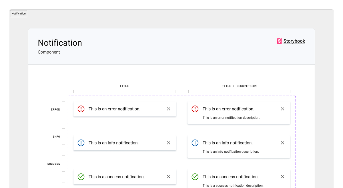
Notifications
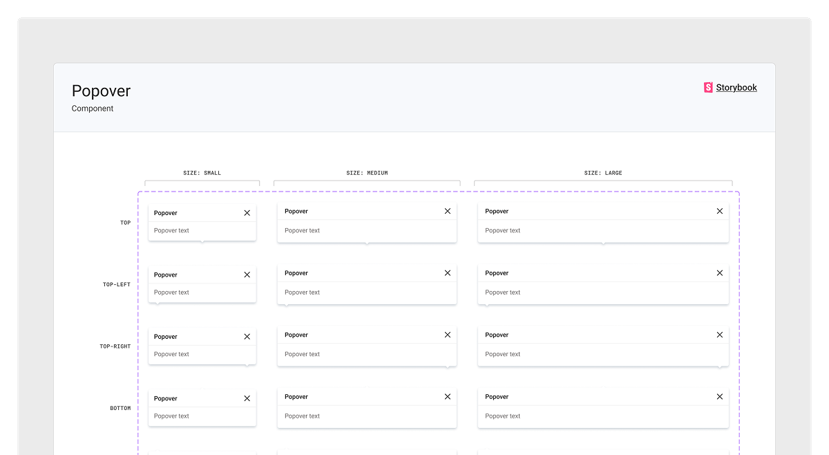
Popover
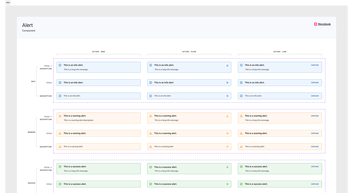
Alert
Tier 3️⃣ — Domain Specific Components and Patterns
Domain specific charts, progress indicators, etc.
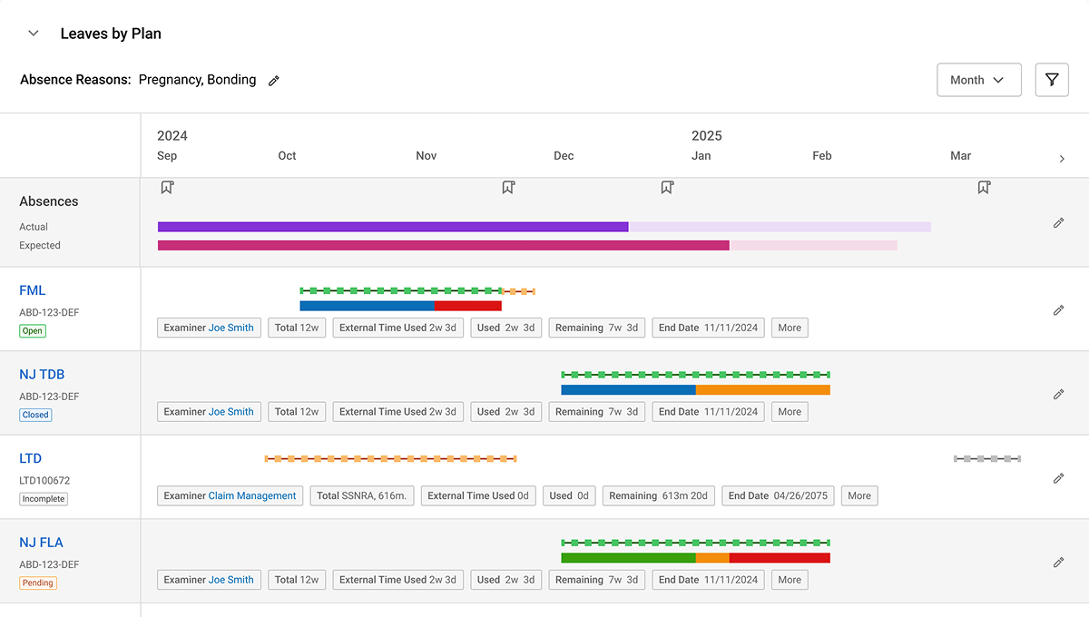
Claim Specific Pattern
Cash Management Specific Pattern
6️⃣ Design + Engineering Alignment
A key senior-level contribution was establishing design–code parity. We partnered with UI Infrastructure Team (including frontend leads) to:
• Map Sketch (then Figma later) components to React components
• Align naming conventions
• Sync variants and states
• Integrate Storybook documentation
• (*Define token structure came later)
🤝 Result: Designers and developers referenced the same system language.
7️⃣ Accessibility Integration
Accessibility was built into components and improved over time. We embedded:
• WCAG AA contrast tokens
• Keyboard interaction patterns
• Focus states
• Screen reader labels
• Error messaging standards
Accessibility checks became part of component acceptance criteria.
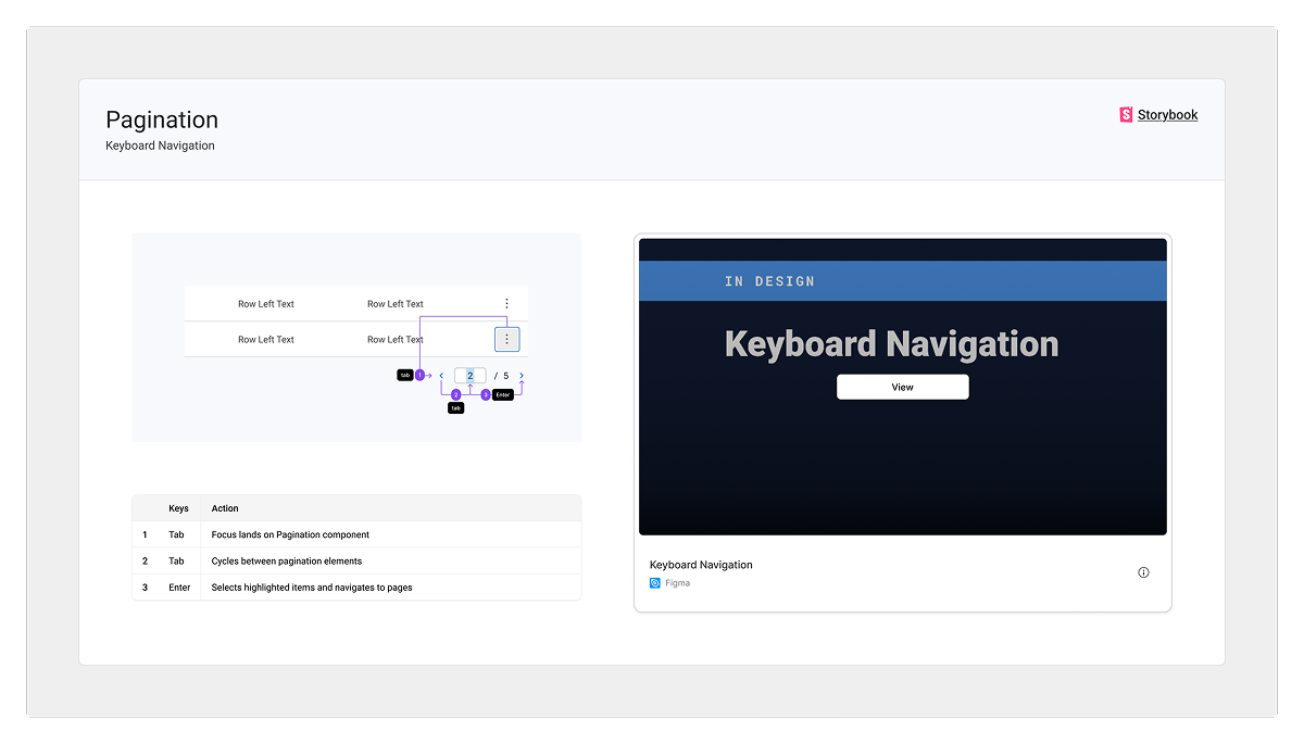
Pagination
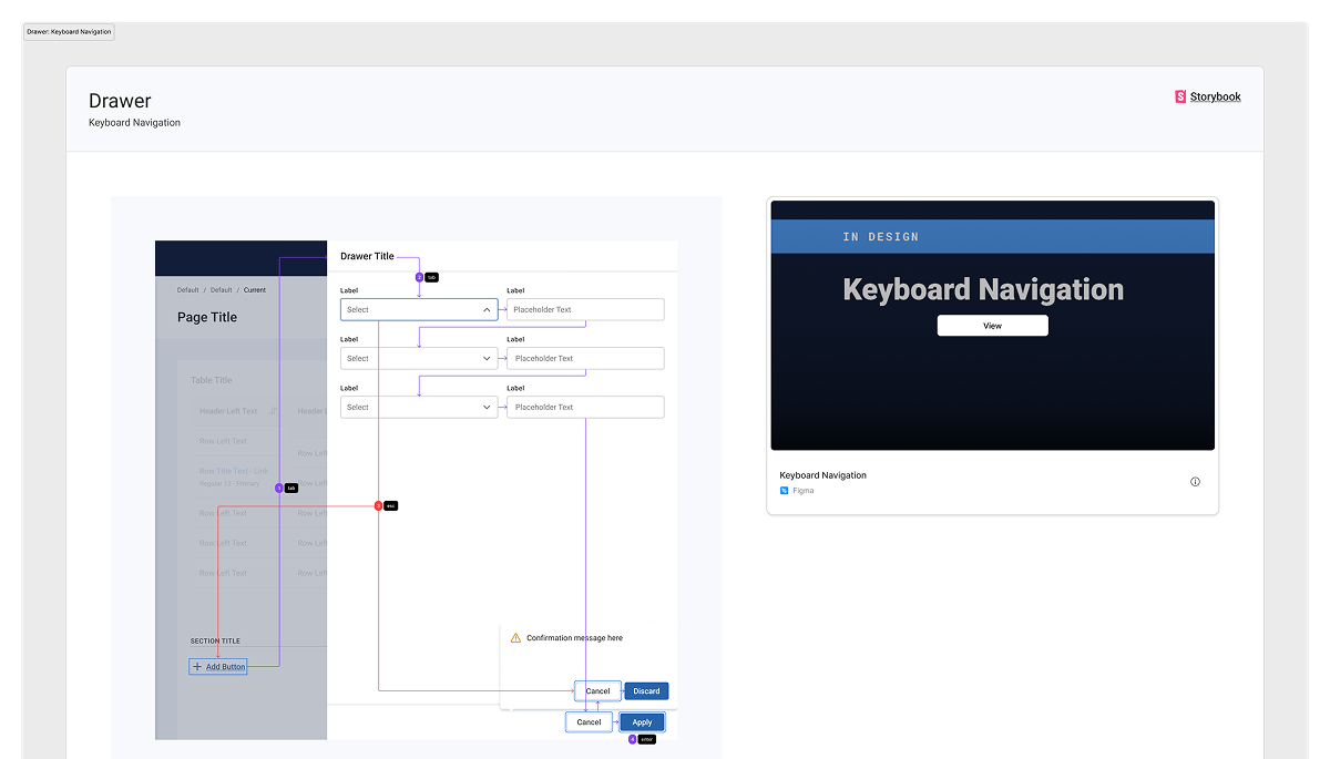
Drawer
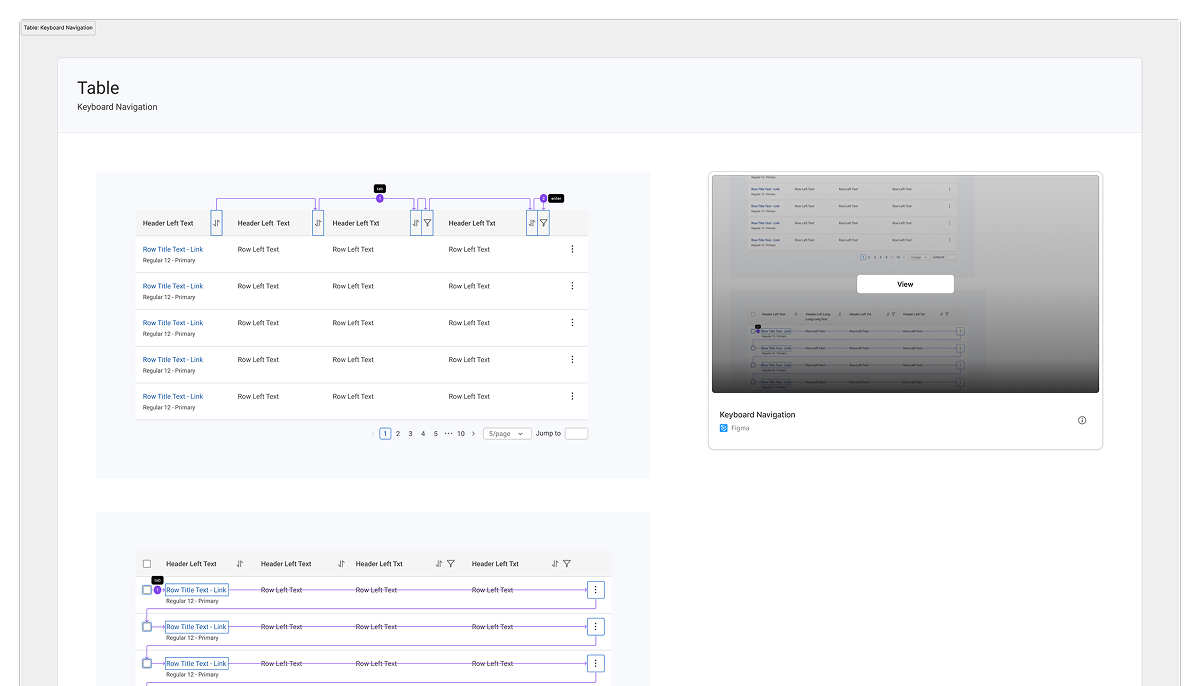
Table
Keyboard Navigation Guidelines
8️⃣ Governance & Contribution Model
Without governance, systems decay. The design team established a lightweight contribution workflow:
➡️ Contribution Flow
Proposal → Design Review → Engineering Review → Accessibility Check → Release
🤝 Collaboration with the UI Infrastructure team on:
• Contribution templates
• Review checklists
• Version tagging
• Deprecation policy
📋 Documentation
Initially the design system documentation was on InVision platform (2020-2023), then migrated to Storybook in 2024.
9️⃣ Adoption Strategy
Adoption required change management, not just assets. I led:
• System onboarding workshops
• Designer training sessions
• Engineering walkthroughs
• Office hours
• Migration guides
The design team targeted key team members from major product teams (including billing, policy, claim, and platform) first then expanded to the rest of the organization.
🔟 Lessons and Improvements
Launching the first enterprise-level design system for EIS Group has been a great learning experience.
🧑🏫 What I've learned:
• Adoption is a people problem more than a design problem
• Governance matters as much as components
• Engineering partnership must start day one
• Training and enablement drive long-term success
🔮 What I would improve in the future:
• Start contribution workflow earlier
• Invest sooner in automated accessibility testing
• Create migration tooling sooner
• Add usage analytics per component